Color psychology in digital design is a fascinating field that explores the profound impact colors have on human emotions, perceptions, and behaviors in the digital realm.
It explores the psychological effects of different hues and shades, examining how they can evoke specific feelings, convey messages, and influence user interactions.
In digital design, understanding color psychology is crucial for creating visually compelling and effective user interfaces. In this blog, we will explore;
- What is Color Theory?
- Evolution of Color Psychology
- How Color Impacts User Experience in Digital Design?
1: What is Color Theory?
Ok, let us start with the basics.
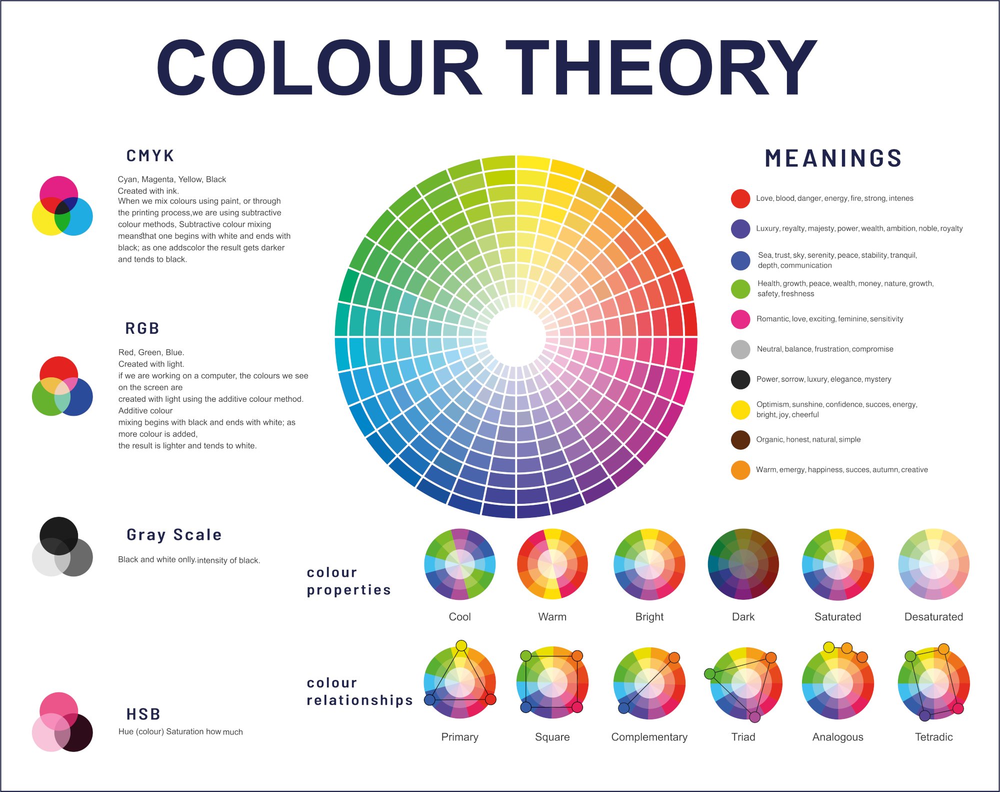
Color theory is a conceptual framework that helps us understand how colors interact, combine, and evoke specific emotions or reactions. It includes the principles and guidelines for creating harmonious and aesthetically pleasing color combinations. The three primary components of color theory are the color wheel, color harmony, and the context of color.
The color wheel is a circular diagram that organizes colors based on their chromatic relationship. It typically includes primary colors (red, blue, and yellow), secondary colors (green, orange, and purple), and tertiary colors formed by mixing a primary color with a neighboring secondary color.
Color harmony explores the rules and guidelines for combining colors in a visually appealing way. Common harmonies include complementary colors (opposite on the color wheel), analogous colors (next to each other), and triadic colors (equally spaced around the wheel).

Understanding the context of color involves considering cultural, psychological, and contextual influences on color perception.
Different cultures may associate specific emotions or meanings with particular colors, and individual experiences can also impact how colors are interpreted. In various fields like art, design, marketing, and psychology, color theory serves as a valuable tool for creating impactful and intentional visual compositions.
2: Evolution of Color Psychology
The study of color psychology has undergone a fascinating evolution over the years, weaving through the realms of art, science, and psychology.
Early color theories, notably explored by Johann Wolfgang von Goethe and Isaac Newton, laid the groundwork for understanding color as a subjective experience.
In the late 19th and early 20th centuries, artists like Wassily Kandinsky delved into the emotional and spiritual impact of colors, further influencing the perceptual aspects of color theory.
The mid-20th century witnessed the rise of color psychology as a formal discipline, with researchers delving into the psychological and physiological responses to color. Notably, the work of Faber Birren, who authored influential books on color psychology, helped bridge the gap between art and science.
In contemporary times, the exploration of color psychology has expanded with advancements in neuroscience and technology.
Research in the fields of cognitive psychology and neuroaesthetics has deepened our understanding of how colors impact the human brain, emotions, and behavior.
The application of color psychology has extended beyond art and design to fields like marketing, where brands strategically leverage colors to influence consumer perceptions and decisions. As our understanding of color psychology continues to evolve, it reflects a dynamic interplay between artistic intuition, scientific inquiry, and practical applications that shape our daily experiences with color.
While pinpointing the "first" web designer to use colors to influence customer journeys is challenging, notable figures, like David Siegel and Jakob Nielsen, played vital roles in shaping early web design.
Siegel, an entrepreneur and web designer, advocated for visually appealing websites, emphasizing the strategic use of colors for emotional impact and brand consistency.
Nielsen, a usability expert, focused on user-centered design, indirectly influencing color choices through contrast and readability principles.
In the early days of the web, designers collaborated in experimentation, gradually incorporating colors to influence user behavior and experience.
David Siegel
David Siegel is a web design pioneer and entrepreneur who gained recognition in the late 1990s for his influential contributions to the field.
He is the author of the book "Creating Killer Websites," which was published in 1997. Although his influence may have diminished somewhat in the rapidly evolving landscape of web design, Siegel's early work had a lasting impact on the industry.

Here are some key aspects of David Siegel's contributions and notable statements related to digital design:
-
Creating Killer Websites: Siegel's book was groundbreaking in its time. It provided insights and practical advice for designers and developers looking to create visually striking and effective websites.
-
Design Principles: Siegel emphasized the importance of design principles in creating compelling websites. He encouraged designers to focus on elements such as visual hierarchy, simplicity, and user experience to make websites more engaging and user-friendly.
-
Style and Substance: One of Siegel's notable perspectives was the idea that style and substance should go hand in hand. While aesthetics are crucial, he argued that they should complement the content and functionality of a website. Striking a balance between visual appeal and usability was a key theme in his approach.
-
Design as a Competitive Advantage: Siegel highlighted the competitive advantage that well-designed websites could provide to businesses. He believed that a visually appealing and user-friendly website could set a company apart from its competitors, making it more memorable and appealing to users.
-
Designing for Attention: In the early days of the web, where attention spans were short, Siegel stressed the importance of designing websites that could capture and maintain users' attention. This involved creating visually engaging and dynamic interfaces to keep visitors interested.
-
Evolution of Web Design: Siegel recognized that web design was evolving rapidly, and he encouraged designers to stay abreast of emerging technologies and design trends. He acknowledged the dynamic nature of the web and the need for designers to adapt to new tools and techniques.
It's important to note that while Siegel's ideas were influential in the late 1990s, the field of web design has evolved significantly since then. Current design practices may differ from those advocated by Siegel, reflecting changes in technology, user expectations, and design trends.
Jakob Nielsen
Jakob Nielsen is a Danish computer scientist and usability engineer who has made significant contributions to the field of user experience (UX) and web usability.
He co-founded the Nielsen Norman Group with Don Norman, which is a consulting firm that focuses on usability, user experience, and human-computer interaction.

Jakob Nielsen is widely regarded as one of the leading authorities on web usability. Here are some key aspects of Jakob Nielsen's contributions and notable statements related to digital design and usability:
- Usability Heuristics: Nielsen developed a set of heuristics, known as "Nielsen's Heuristics" which are a set of general principles for user interface design. These heuristics provide guidelines for creating user-friendly interfaces and have been widely adopted in the field of usability.
- Eye-tracking Studies: Nielsen conducted extensive research on how users read and interact with web content. His eye-tracking studies provided valuable insights into user behavior, helping designers understand how users visually scan and consume information on websites.
- F-Shape Reading Pattern: Nielsen's research revealed that users often follow an "F-shaped" pattern when reading web pages. This means that users typically scan the page in an F-shaped pattern, focusing more on the top and left sides of the content.
- Information Foraging Theory: Nielsen introduced the concept of Information Foraging Theory, which draws parallels between how animals forage for food and how users seek information on the web. According to this theory, users make decisions about where to click based on the perceived value of the information they expect to find.
- Mobile Usability: Nielsen emphasized the importance of mobile usability as smartphones and mobile devices become increasingly prevalent. He provided guidelines for optimizing websites for mobile users, advocating for responsive design and mobile-friendly interfaces.
- Usability Testing: Nielsen is a strong advocate for usability testing as a crucial component of the design process. He encourages designers to conduct regular usability testing with actual users to identify issues and improve the overall user experience.
- Accessibility: Nielsen has stressed the importance of designing accessible websites to ensure that people with disabilities can effectively use and navigate digital interfaces. He has contributed to guidelines for creating inclusive and accessible designs.
- Homepage Usability: Nielsen has researched homepage usability, providing insights into how users form first impressions of websites and what elements contribute to a positive user experience on the homepage.
Jakob Nielsen's work has had a profound impact on the field of user experience and usability. His research, guidelines, and heuristics continue to influence designers and developers in creating more user-friendly and effective digital experiences.
3: How Color Psychology Impacts Digital Design?
Colors play a pivotal role in shaping the overall user experience, influencing users' moods, and guiding their attention. Whether designing a website, mobile app, or any other digital platform, the strategic use of colors can enhance usability, communicate brand identity, and even encourage desired actions.
They can also influence our decision-making. According to HubSpot, up to 90% of an initial impression comes from color.
Knowing that, designers utilize colors to evoke various emotions and reactions from those who view them.
How colors affect each person may differ based on factors such as age, gender, or culture. However, certain colors are commonly associated with specific emotions.
| Often associated with passion, energy, and intensity, red can evoke strong emotions. It's also linked to warmth and can stimulate appetite, making it a popular choice in food branding. On the flip side, it can signify danger or caution. | |
| Blue is often associated with calmness, tranquility, and stability. Lighter shades can convey a sense of serenity, while darker blues may evoke feelings of depth and reliability. Many tech companies use blue in their branding to convey trust and professionalism. | |
| As the color of nature, green is often associated with growth, renewal, and freshness. It has a calming effect and is frequently used in environmental and health-related contexts. Darker greens may symbolize wealth and stability. | |
|
Yellow is often linked to positivity, energy, and happiness. It's a vibrant and attention-grabbing color, making it suitable for highlighting and creating a sense of optimism. However, excessive use of yellow can be overwhelming. |
|
|
Often associated with luxury, royalty, and sophistication, purple can convey a sense of elegance and mystery. It's a color that combines the energy of red and the stability of blue, making it versatile in different contexts. |
|
| Orange is a warm and energetic color associated with enthusiasm and creativity. It can create a sense of excitement and is often used in marketing to draw attention. In some cultures, it symbolizes spirituality and endurance. | |
| Pink is often associated with sweetness, playfulness, and romance. Lighter shades evoke a sense of innocence, while deeper pinks may convey passion. It's a color commonly used in industries related to beauty and fashion. | |
|
Brown is often associated with stability, reliability, and a connection to the earth. It can convey a sense of warmth and comfort. In some contexts, it's used to create a rustic or natural feel. |
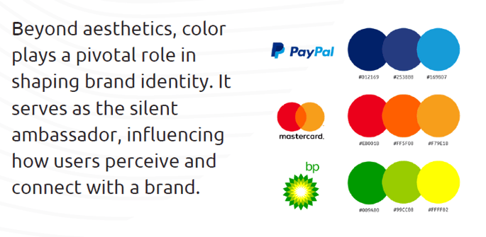
Marketing has leveraged colors for years to establish deeper connections between customers and brands. Often, a brand can be recognized solely by its color tone.
According to HubSpot, color can increase brand awareness and recognition by 80%.

When we look at some of the known brands, we will see a similar story. For example;
| The iconic red color of Coca-Cola's logo is associated with energy, passion, and excitement. It's a bold and attention-grabbing choice that aligns with the brand's dynamic image. | |
|
Facebook's blue logo is associated with trust, reliability, and calmness. The use of blue helps convey a sense of security and professionalism, fostering a trustworthy environment for social interaction. |
|
|
|
McDonald's combines red and yellow in its logo. Red stimulates appetite and creates a sense of urgency, while yellow is associated with happiness and positivity. Together, they create an inviting and energetic atmosphere. |
| Starbucks uses a green logo, which aligns with nature, growth, and freshness. The green color choice reflects the brand's commitment to quality, sustainability, and a connection to the environment. | |
|
Nike's iconic swoosh logo is often presented in black or white. Black represents power, strength, and elegance, while white signifies simplicity and cleanliness. The combination reflects Nike's commitment to performance and style. |
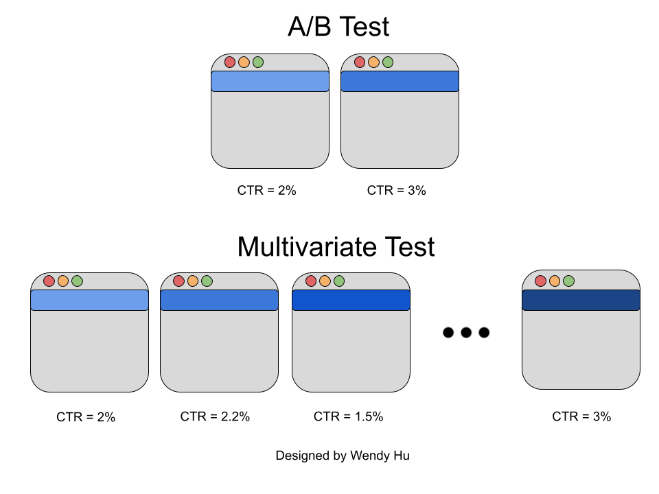
For digital design, colors rank among the most crucial aspects when UX and UI designers create website journey experiences. One famous example is Google's experiment with 41 shades of blue, testing which color would be more efficient for their Call-to-Action buttons. In result, users were more likely to click on the toolbar with the greener blue.

However, colors are not limited to marketing only; they play roles in medical therapies, sports, and various other fields. As one of the pioneers in this field, Carl Jung, stated, "Colors are the mother tongue of the subconscious."
So, to sum up, here are a couple of points for you to remember while developing a digital design;
- Brand Identity: Consistent use of colors helps establish and reinforce brand identity. When users consistently encounter specific colors associated with a brand, it contributes to brand recognition and fosters a sense of trust and familiarity. Ensure chosen colors align with established brand identity for consistent recognition.
- Readability and Accessibility: The choice of text and background colors is crucial for ensuring readability. High contrast between text and background improves legibility, while carefully chosen color combinations enhance the overall reading experience. Prioritize readability with sufficient contrast; adhere to accessibility standards.
-
Aesthetic Appeal: Colors contribute significantly to the visual aesthetics of a user interface. Thoughtful color choices can make a design visually appealing, engaging, and memorable, creating a positive first impression for users.
- Emotional Impact: Colors have the power to evoke emotions and set the tone for the user experience. Warm colors like red and orange may create a sense of energy or urgency, while cool colors like blue and green may convey calmness or trust. Choose colors to evoke desired emotions based on psychological impact.
- Hierarchy and Contrast: Colors are often used to establish a visual hierarchy within a user interface. By assigning different colors to elements such as headings, buttons, and backgrounds, designers can guide users' attention and communicate the relative importance of various elements on a page. Establish a visual hierarchy and utilize contrast to guide attention.
- Cultural Considerations: Colors can have cultural and contextual meanings that designers need to consider. For example, certain colors may have different cultural associations, and designers should be mindful of these nuances to create inclusive and culturally sensitive designs. Be mindful of cultural associations for a globally-appropriate color palette.
- Consistency Across Devices: Consistent use of colors across different sections of an interface aids in navigation. Users can associate specific colors with certain actions or categories, making it easier for them to navigate and understand the structure of the digital product. Ensure colors look consistent across various devices and screen sizes.
Today, as we consider factors from brand identity to accessibility, the significance of thoughtfully chosen colors persists. Navigating through the hues that shape our online experiences, we continue to uncover the intricate language that colors speak to the subconscious, contributing to the ever-evolving tapestry of web design.
If you would like to know more about how to create websites with great user experience, you can check our Digital Experience and Development service page.


