CTAs serve as the gateway between your audience and your desired action, whether it is making a purchase, signing up for a newsletter, or downloading a resource. They provide a clear direction to users, guiding them toward the next step in the conversion process. From banner ads to social media posts and email newsletters, a strategically crafted CTA has the power to significantly boost user engagement, drive conversions, and ultimately, enhance ROI.
In this article, we will talk about:
- What is a CTA?
- The Birth of CTA
- Evolution in Print Advertising
- Transition to Digital Advertising
- Psychology Behind CTAs
- 10 Tips to Create Good CTAs
- Conclusion
What is a CTA?
A Call to Action (CTA) is a crucial element in advertising campaigns across various mediums, whether it is print, digital, or broadcast. Essentially, it's a directive that prompts the audience to take a specific action, usually related to the product or service being advertised. The goal of a CTA is to motivate potential customers to engage further with the brand, ultimately leading to conversions and sales.
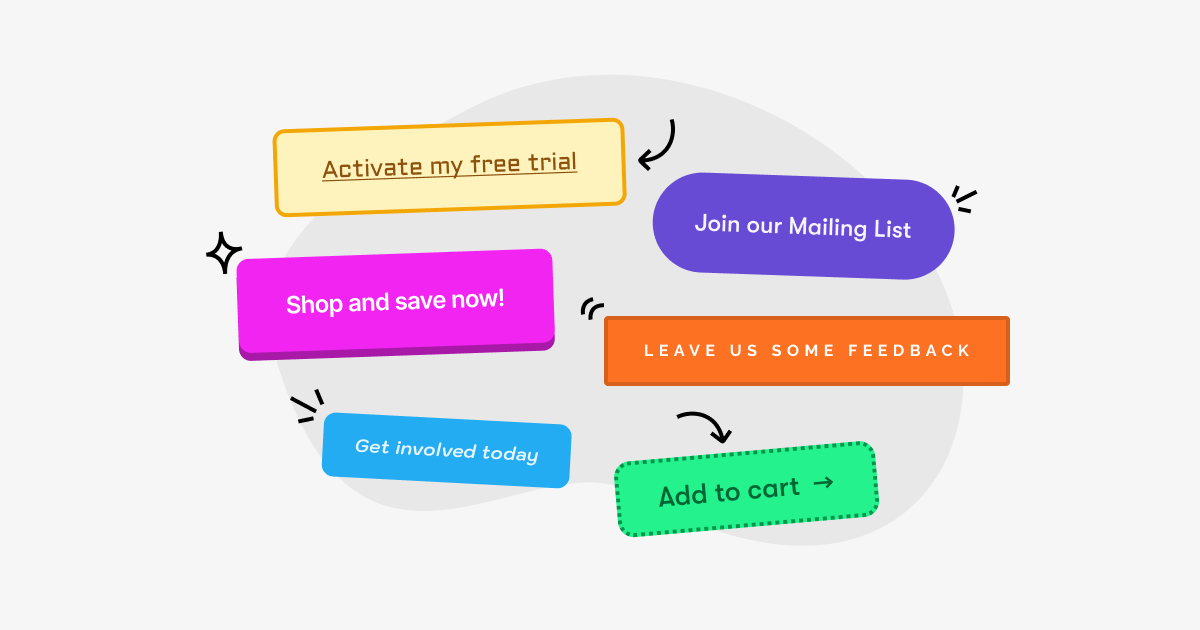
CTAs can take many forms, from simple phrases like "Buy Now" or "Learn More" to more creative and personalized messages tailored to the target audience. The effectiveness of a CTA lies in its clarity, relevance, and ability to resonate with the audience's needs and desires.
In digital advertising, CTAs are often integrated into clickable buttons or hyperlinks within online ads, emails, or website landing pages. These CTAs may direct users to make a purchase, sign up for a newsletter, download an app, or request more information.

The Birth of CTA
The concept of the call-to-action can be traced back to the early days of advertising, when businesses sought to entice consumers to take specific actions, such as making a purchase or visiting a store.
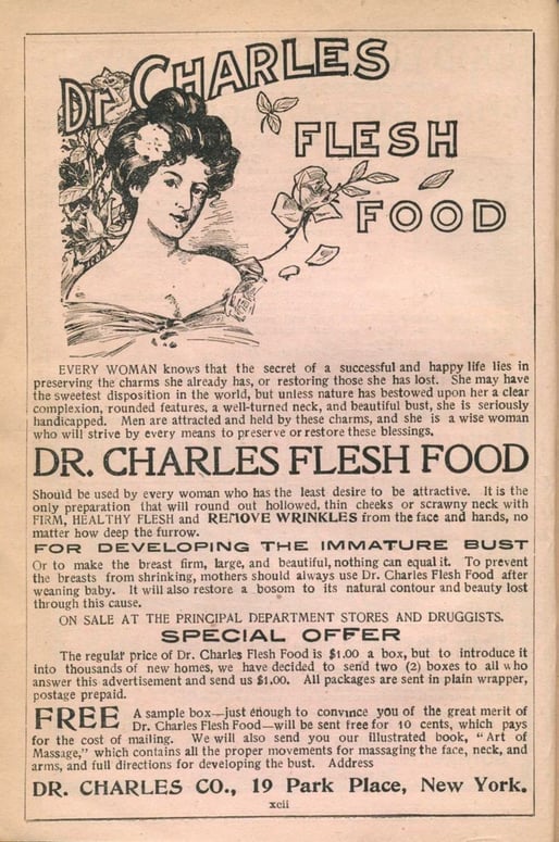
In the late 19th and early 20th centuries, print advertisements commonly included phrases like "Buy now!" or "Act fast!" to prompt immediate action from readers. These early CTAs were straightforward, aiming to capitalize on the limited attention spans of consumers.
For example, check the newspaper ads below, from the 19th century. You can already see call-to-actions such as SPECIAL OFFER or FREE.

Evolution in Print Advertising
As advertising techniques evolved, so too did the sophistication of CTAs in print media. Advertisers began experimenting with different language and design elements to make their CTAs stand out amidst the clutter of competing ads. Bold headlines, eye-catching graphics, and persuasive copy became common strategies for capturing the audience's attention and driving desired actions.

Transition to Digital Advertising
With the advent of the internet and digital technologies, the landscape of advertising underwent a profound transformation. Digital platforms offered new opportunities for advertisers to reach consumers with targeted messaging and personalized experiences.
CTAs became an essential component of digital marketing campaigns, appearing in banner ads, email newsletters, social media posts, and website pop-ups. Advertisers began leveraging data and analytics to optimize CTAs for maximum impact, testing different variations to determine what resonated best with their target audience.

Psychology Behind CTAs
Understanding the psychology behind call-to-action (CTA) mechanisms is crucial for crafting effective marketing strategies that prompt desired behaviors from consumers. At its core, the psychology of CTAs taps into fundamental human motivations and cognitive biases, guiding people toward making quick decisions. Here's a brief overview:
- Urgency and Scarcity: The Fear of Missing Out (FOMO) plays a significant role in decision-making. When a CTA suggests that an offer is limited in time or quantity ("Offer ends soon!" or "While supplies last!"), it triggers a sense of urgency and scarcity, compelling users to act promptly to avoid missing out on a valuable opportunity.
- Authority: People are inclined to follow the lead of experts or authoritative figures. CTAs that leverage endorsements or recommendations from professionals or influencers can significantly increase the perceived value of an offer, making users more likely to take the suggested action.
- Social Proof: CTAs that incorporate elements of social proof, such as testimonials, user reviews, or social media shares, tap into the human tendency to observe and mimic the actions of others. Knowing that others have taken a step and found value in it reduces perceived risk and increases trust, encouraging similar behaviors.
- Reciprocity: The principle of reciprocity implies that people feel obliged to give something back when they receive something. CTAs offering a free trial, sample, or valuable information can evoke a sense of indebtedness, making individuals more inclined to respond positively to the request for action.
- Clarity and Simplicity: The human brain seeks clarity and shies away from complexity. A clear, concise, and straightforward CTA reduces cognitive load, making it easier for individuals to process the information and decide to take action. Complicated messages or choices can lead to decision paralysis, significantly lowering conversion rates.
- Color and Design: Psychological responses to colors and design elements can also influence the effectiveness of a CTA. For instance, the color red can evoke feelings of excitement and urgency, while green is often associated with go or approval. The visual contrast between the CTA and its surroundings can also attract attention and guide the user's eye toward the desired action. You can read more about how color and design impact user behavior on our blog Color Psychology in Digital Design.
10 Tips to Create Good CTAs
Creating compelling call-to-actions (CTAs) is an art that combines psychology, design, and strategic positioning to motivate potential customers to take a desired action. Whether you’re aiming to increase website traffic, boost sales, or encourage sign-ups, crafting effective CTAs is critical. Here are actionable steps to create CTAs that truly convert:
- Start with a Strong Command Verb: Begin your CTA with a verb that compels action, such as "Buy", "Download", "Subscribe" or "Learn". This immediately makes it clear what action you want the user to take.
- Use Words That Provoke Emotion or Enthusiasm: The best CTAs stir up emotions that compel users to act. Use words that evoke a sense of urgency, curiosity, excitement, or exclusivity. Phrases like “Limited offer", “Join the revolution", or “Start your adventure" can be much more enticing than a simple “Click here".
- Give a Reason Why: Explain the benefit of taking the action. Users are more likely to click on a CTA if they understand what’s in it for them. For instance, “Download the eBook to become an SEO expert in days" tells users exactly what to expect and the value they will receive.
- Create a Sense of Urgency: Leveraging the fear of missing out (FOMO) can be very effective. Use time-sensitive language or highlight the exclusivity of an offer to encourage users to act quickly. Words like “Now", “Today", or “Only 2 left" prompt immediate action.
- Make It Visually Striking: Your CTA should stand out visually from the rest of your page or ad. Use contrasting colors, but make sure they align with your brand. The size of the CTA button should be large enough to notice but not overwhelming. White space around the CTA can also help draw attention to it.
- Keep It Simple and Clear: The message should be straightforward and concise. Users should understand what they will get and what they need to do at a glance. Avoid jargon or complicated terms that might confuse them.
- Place CTAs Strategically: Placement matters. On a webpage, for instance, putting a CTA above the fold ensures it’s seen without scrolling. In an email, positioning a CTA after a compelling message increases the likelihood of clicks. Test different placements to see what works best for your audience.
- Ensure Mobile-Friendliness: With increasing mobile usage, your CTA must be easy to see and click on smaller screens. Make sure buttons are touch-friendly, with enough padding to prevent accidental clicks.
- Test and Optimize: Not all CTAs will perform the same across different platforms or audiences. Use A/B testing to try out different texts, colors, placements, and sizes to see what works best. Continuously analyze the performance and optimize based on your findings.
- Align with the User's Stage in the Buyer's Journey: Tailor your CTA based on whether the user is at the awareness, consideration, or decision stage. For example, a user at the awareness stage might respond better to a “Learn More" CTA, while one at the decision stage might be more inclined to “Buy Now".
Conclusion
Calls to Action (CTAs) are important elements that bridge the gap between consumer interest and action, driving the dynamic of digital marketing forward from its inception in early print advertising to today's digital age.
They encapsulate a blend of art and science, combining psychological principles with strategic design to compel audience engagement and conversion. From the straightforward appeals of the 19th century to the sophisticated, data-driven strategies of the digital era, CTAs have evolved significantly.
By understanding the psychology behind CTAs, including the importance of urgency, authority, social proof, reciprocity, clarity, and visual appeal, marketers can craft compelling prompts that resonate deeply with their audience. Moreover, the practical tips provided for creating effective CTAs —emphasizing strong command verbs, emotion, urgency, simplicity, strategic placement, mobile-friendliness, and continuous testing— serve as a blueprint for converting interest into action.
Ultimately, a good call to action is not just about prompting an immediate response; it's about forging lasting connections with consumers and guiding them through their journey from curiosity to commitment. If you need support with increasing your conversion rates and hence ROI, NMQ Digital is here with its Performance Marketing Services.


