In the digital age, the significance of data visualization cannot be overstated. As the world generates an unprecedented volume of data each day, almost 463 exabytes per day, the ability to extract meaningful insights from this vast information reservoir becomes crucial. In this blog, we will focus on,
- What is Data Visualization and Why It Matters
- Data Visualization Types and Choosing the Right Visualization
- Data Literacy and Design Principles for Effective Data Visualization
- Data Visualization Tools and Software
- Why Storytelling is Important for Data Visualization
- Challenges and Future Trends in Data Visualization
What is Data Visualization and Why It Matters
Data visualization is the art of translating complex data sets into visually appealing and understandable representations, such as charts, graphs, and infographics. By presenting data in a visual format, data visualization not only simplifies complex information but also enhances comprehension and retention. It empowers decision-makers and individuals to quickly grasp patterns, trends, and relationships that might be challenging to discern in raw data. In turn, this ability to make sense of data efficiently paves the way for data-driven decision-making, a cornerstone of success in today's data-centric world.

The human brain has a natural affinity for visual information, making it more adept at processing visual elements compared to textual data. Actually, 90% of the information transmitted to the brain is visual.
This phenomenon, known as the "picture superiority effect," stems from the brain's ability to process images rapidly and efficiently. According to the research by the University of Minnesota, the human brain processes visuals 60,000x faster than textual information, allowing individuals to absorb and comprehend visuals with remarkable speed.
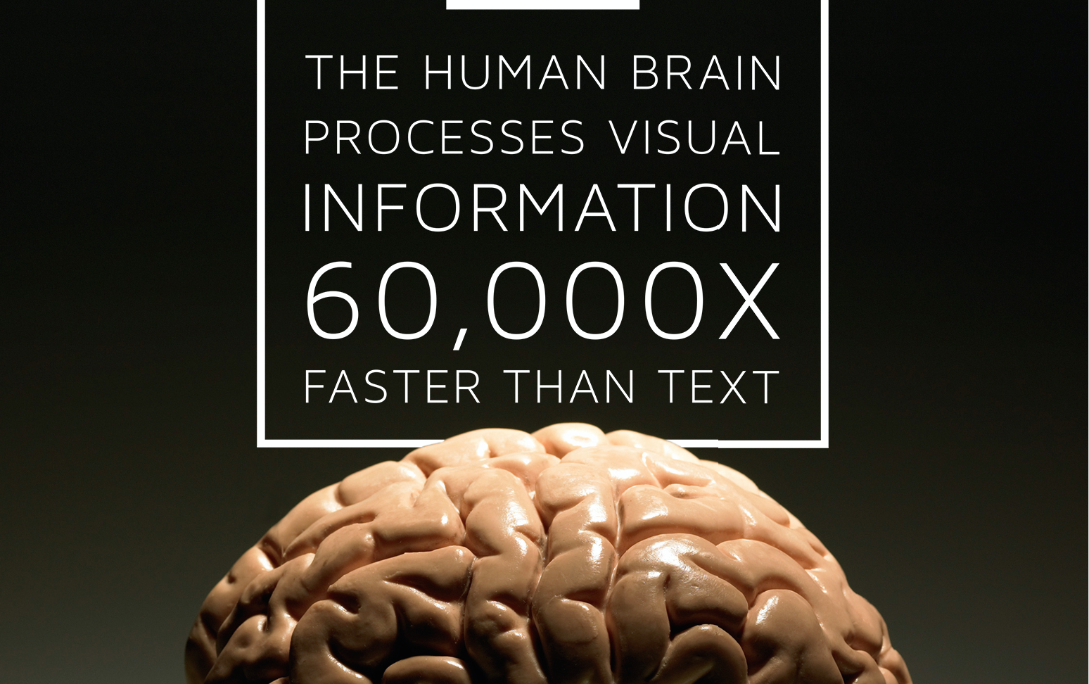
Visual elements, such as charts, graphs, and diagrams, leverage the brain's inherent pattern recognition abilities, making it easier for people to assimilate complex information and draw connections between data points. As a result, data presented visually not only captures attention but also enhances understanding and memory retention, creating a lasting impact on the audience. That is why when you hear something, you remember 10% of it after 3 days, while when you see something, you get to keep 65%.
However, understanding raw data without visual aids can be challenging, especially for individuals who lack technical expertise or data literacy. Raw data often appears as a series of numbers, tables, or text, which may overwhelm or confuse the average person. Without proper visualization, valuable insights and patterns hidden within the data can remain obscured, limiting the potential for data-driven decision-making.
Data visualization plays a vital role in overcoming these challenges by translating abstract data into accessible and compelling visuals. By representing data points in charts or graphs, data visualization simplifies complex concepts and allows for quick comprehension of trends and relationships. As a result, insights derived from data visualization become more digestible and actionable, benefiting a broader audience, from executives and analysts to customers and stakeholders. The democratization of data through visualization ensures that valuable information reaches those who need it, empowering them to make informed choices and driving a data-driven culture within organizations.
Data Visualization Types & Choosing the Right Visualization
Data visualization offers a diverse array of tools and techniques to present information effectively. Various visual elements can be employed to transform complex datasets into easily understandable representations. Some common types of data visualizations include charts, graphs, maps, infographics, and dashboards.
- Charts and Graphs
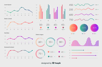
Charts and graphs are versatile visualizations that depict numerical data using visual elements such as bars, lines, pies, or points. Bar charts are excellent for comparing categorical data, while line graphs show trends over time. Pie charts are ideal for illustrating parts of a whole, and scatter plots reveal relationships between two variables. These visualizations are best suited for presenting quantitative data, making it easier to spot patterns, comparisons, and trends. - Maps
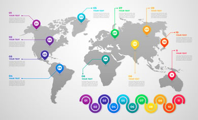
Maps are powerful tools for representing geographical data and spatial relationships. They are valuable for displaying location-specific data, such as regional sales performance, customer distribution, or the spread of a disease outbreak. By visualizing data on a map, insights related to location-based patterns and regional variations can be readily understood.
- Infographics
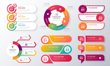
Infographics combine text, images, and illustrations to convey complex information in a visually engaging and concise manner. They are particularly effective in presenting a story or summarizing data-driven insights for a broader audience. Infographics are often used for sharing survey results, statistical information, or research findings in an appealing and accessible format.
- Dashboards
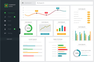
Dashboards are comprehensive visual displays that combine multiple data visualizations into a single interface. They offer real-time and interactive insights, providing a holistic view of key performance indicators (KPIs) and metrics. Dashboards are frequently employed in business settings to monitor organizational performance, sales analytics, marketing metrics, and other vital data in one centralized location.
Determining the appropriate type of data visualization depends on the nature of the data and the insights to be conveyed. Selecting the right type of data visualization is crucial to effectively communicate the story behind the data and ensure that the intended audience gains meaningful insights from the presented information. You can also visit Venngage to get some ideas.
Below are some tips to help you choose the right visual to convey your message and story.
- Understand the data: Begin by thoroughly understanding your dataset and the type of information it contains. Identify the variables, their relationships, and the story you want to convey through visualization. Different datasets may require specific visualizations to highlight the key insights effectively.
- Clarify the goals of analysis: Define the objectives of your data analysis and the specific questions you want to answer. Are you trying to show trends over time, compare categories, or reveal spatial patterns? Identifying the analysis goals will guide you in selecting the most relevant visualization type.
- Consider data type: Assess whether your data is numerical, categorical, or temporal. Numeric data is often suitable for charts and graphs, while categorical data might be better represented using bar charts or pie charts. Temporal data can be effectively displayed with line graphs or time-series plots.
- Simplify complexity: Avoid overcrowding visualizations with excessive data points or unnecessary elements. Keep the visuals clean and simple to ensure that the key insights are easily discernible. Prioritize clarity and avoid unnecessary visual distractions.
- Choose the right chart type: Select a chart or graph that best represents the relationship between variables. For instance, use bar charts for comparisons, line graphs for trends, and scatter plots for correlations. Choosing the appropriate chart type enhances the accuracy of your data representation.
Data Literacy & Design Principles for Effective Data Visualization
When selecting visuals for your data, it's vital to consider the level of data literacy and comprehension among your target audience. Data literacy refers to the ability to read, interpret, and analyze data effectively. Here's why it matters:
- Accessibility and understanding: Using visuals that align with your audience's data literacy level ensures that they can easily grasp the insights presented. Avoid overly technical or complex visualizations if your audience is not familiar with data analysis.
- Engagement and communication: Visualizations that match the audience's data literacy promote engagement and encourage them to interact with the data. Engaged audiences are more likely to make data-driven decisions and derive value from the presented information.
- Avoid misinterpretation: Misleading visualizations can lead to misinterpretation and erroneous conclusions. Considering data literacy helps you create accurate and transparent visuals that convey the intended message without ambiguity.
- Educational opportunity: Tailoring visuals to the audience's data literacy level provides an opportunity for education and growth. As the audience becomes more familiar with data representations, they can evolve to understand more complex visualizations.
In short, selecting the most appropriate visualization for specific datasets and analysis goals is crucial to effectively communicate insights. Considering the audience's data literacy level ensures that the visuals are accessible, engaging, and correctly understood. By striking the right balance between data representation and audience comprehension, data visualizations become powerful tools in driving data-driven decision-making and fostering a data-literate culture.
If you are not sure and are looking for best practices to design your visualization, here are some best practices for you to follow;
- Keep it simple: Keep your data visualizations simple and uncluttered. Avoid unnecessary embellishments or decorative elements that may distract from the core message. A clean design allows the audience to focus on the data insights without confusion.
- Make it clear: Ensure that your visualizations clearly convey the intended message. Use descriptive titles, axis labels, and annotations to provide context and explanations for the data. Avoid ambiguity and make sure the data interpretation is evident.
- Keep it consistent: Maintain a consistent visual style throughout your data visualizations. Use the same color palette, font, and layout across charts and graphs to create a cohesive and professional presentation. Consistency enhances recognition and reinforces the message.
- Make it relevant: Tailor your data visualizations to the specific audience and analysis goals. Present only the most relevant data and avoid including unnecessary details that might dilute the key insights.
- Use the right data: Ensure the accuracy of your data and representations. Double-check the data sources, calculations, and visual elements to avoid errors that could mislead the audience.
Data Visualization Tools and Software
In the world of data visualization, several powerful tools and software have emerged, revolutionizing the way users create, explore, and interact with data-driven visuals. Let's take a brief look at some of the most popular data visualization tools:
- Tableau
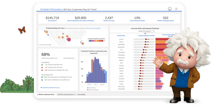
Tableau is a widely acclaimed data visualization platform known for its user-friendly interface and versatility. With Tableau, users can connect to various data sources, including spreadsheets, databases, and cloud services, making it easy to import and analyze data. The drag-and-drop functionality allows users to quickly create a wide range of visualizations, from bar charts and line graphs to heatmaps and treemaps. Tableau's interactive features enable users to filter, drill down, and explore data dynamically, gaining deeper insights. Additionally, Tableau offers robust sharing capabilities, allowing users to publish interactive dashboards to the web or Tableau Server, fostering collaboration and data accessibility. - Power BI
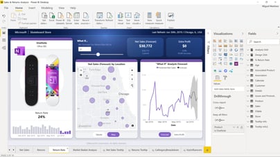
Power BI is Microsoft's data visualization and business intelligence platform that seamlessly integrates with other Microsoft products. It empowers users to connect to various data sources, including Excel, SQL Server, and cloud-based services like Azure. Power BI offers an extensive collection of pre-built data visuals, as well as custom visualizations created by the user community. The platform's strength lies in its ability to create visually appealing and interactive dashboards, reports, and scorecards that can be easily shared with colleagues or embedded in web applications. Power BI's natural language processing feature allows users to ask questions in plain English and receive instant visual responses, enhancing the user experience and accessibility. - Google Data Studio (aka Looker Studio)
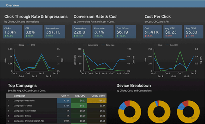
Google Data Studio (which now is changed to Looker Studio) is a powerful and user-friendly data visualization and reporting tool offered by Google. It enables users to create customizable, interactive reports and dashboards by connecting to various data sources like Google Analytics, Google Ads, Google Sheets, and many others. With its drag-and-drop interface and a wide range of data visualization options, Google Data Studio makes it easy to transform complex data into visually appealing and easy-to-understand reports. Users can collaborate with team members by sharing live links to the reports, allowing for real-time data updates and seamless collaboration. Whether you're a marketing professional tracking campaign performance or a business owner monitoring key metrics, Google Data Studio empowers you to derive valuable insights from your data, aiding in data-driven decision-making and achieving business goals efficiently.
These data visualization tools have become indispensable assets for professionals and organizations seeking to gain valuable insights from their data. They empower users to present complex information in a visually engaging and interactive manner, making data-driven decision-making more accessible to a broader audience. Whether it's Tableau's intuitive drag-and-drop interface, Power BI's seamless integration with Microsoft products, each tool provides unique capabilities that contribute to a more data-literate and visually compelling world.
Why Storytelling is Important for Data Visualization
Whatever you do, make sure your data tells a story, because it helps make data more accessible, understandable, and impactful to a wider audience. Data visualization alone can present information in a visually appealing way, but without context or a narrative, it might not effectively convey its significance or insights. Here are some reasons why storytelling is important in data visualization:
- Contextualization: Data visualization is most effective when it is presented within a broader context. By crafting a narrative around the data, you provide the audience with the necessary background information, explaining what the data represents, where it came from, and why it matters. This context helps viewers grasp the significance of the data and its relevance to real-world situations.
- Engaging the audience: People are naturally drawn to stories. By using storytelling techniques in data visualization, you capture the audience's attention and keep them engaged. When data is presented as a story, it becomes more relatable and memorable, making it easier for the audience to retain and recall the information.
- Making complex data understandable: Data can be complex and overwhelming, especially for non-experts. A well-crafted story can break down complex data into digestible chunks, guiding the audience through the information in a logical and coherent manner. This simplification of the data allows people to grasp the key insights and draw meaningful conclusions.
- Emotional connection: Stories have the power to evoke emotions, and emotions can drive decision-making and action. By incorporating storytelling elements, such as human anecdotes or real-life examples, data visualization can connect with the audience on a more personal level, making the data more compelling and impactful.
- Supporting data-driven decision-making: Data visualization is often used to support decision-making processes. By weaving a story around the data, you can guide decision-makers through the information, enabling them to understand the implications and potential outcomes of different choices. This can lead to more informed and effective decision-making.
- Memorability: Stories are more memorable than raw data or statistics. When data is presented in a compelling narrative, the audience is more likely to remember the key points and insights, making the data more actionable in the future.
In summary, storytelling enhances data visualization by providing context, engagement, comprehension, emotional connection, and a memorable experience. By combining the power of data with the art of storytelling, you can create more effective data visualizations that have a lasting impact on your audience.
Challenges and Future Trends in Data Visualization
While data visualization is a powerful tool for conveying insights, it also comes with its fair share of challenges.
- One of the primary challenges is ensuring data accuracy and integrity. Inaccurate or incomplete data can lead to misleading visualizations, compromising the decision-making process. Data analysts must exercise caution in validating and cleaning datasets to prevent erroneous conclusions.
- Another significant challenge is the presence of biases in data and visualization design. Biases, whether in data collection or representation, can inadvertently sway interpretations, leading to misinformed decisions. Data analysts should be vigilant in identifying and addressing biases to maintain the objectivity and credibility of their visualizations.
- Additionally, cognitive overload is a concern when designing data visualizations. Presenting too much information or using complex visuals can overwhelm the audience, hindering their ability to absorb and comprehend insights. Striking the right balance between simplicity and data richness is essential to ensure that visualizations are accessible and effectively convey the intended message.
When it comes to trends, as data visualization continues to evolve, emerging trends are reshaping the way we interact with data.
Augmented reality (AR) and virtual reality (VR) applications are two cutting-edge trends transforming data visualization experiences. AR overlays digital elements onto the real world, while VR immerses users in a simulated environment. Both technologies enhance data exploration by providing interactive and immersive experiences. With AR, users can visualize data on physical objects, such as product prototypes or geographical landmarks, bringing insights to life in real-world contexts. VR, on the other hand, offers 3D environments for data exploration, enabling users to manipulate and interact with data points as though they were physically present. These trends are breaking barriers between data and decision-makers, fostering deeper engagements with information and promoting data-driven innovations. As AR and VR technologies advance, we can expect data visualization to become more immersive, intuitive, and impactful, opening up new possibilities for understanding complex datasets and making informed choices.
To wrap up, data visualization is the catalyst that turns raw data into actionable visuals, empowering us to extract valuable insights and make informed decisions. Its role in simplifying complex information, revealing patterns, and enhancing data comprehension is pivotal across various fields. From businesses optimizing operations to healthcare professionals improving patient care, data visualization becomes the bridge that connects information to real-world impact. If you need any support in the process of data collection, visualization, analysis, and insights generation, NMQ Digital is here with its Data & Analytics Services.
