


07.1.2024 Onur Yıldız
Nowadays we are using all sorts of gadgets to surf the internet. From tiny smartphones to big desktop screens, there's a ton of variety. But how do websites manage to look good on all of them? Responsive design!
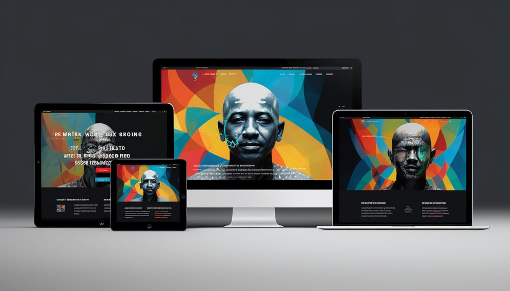
Responsive design ensures that a website or application adapts seamlessly to the user's device, providing an optimal viewing experience across desktops, laptops, tablets, and smartphones. As technology continues to evolve and the number of mobile users surges, embracing responsive design principles is no longer a luxury but a necessity for businesses and developers striving to stay ahead in the competitive online landscape.
In this blog we will focus on;
- Foundations of responsive design
- Why responsive design is important?
- Benefits of responsive design
- Best practices for designers
The foundation of responsive design
Responsive design is an approach to web design and development aimed at creating websites and applications that provide an optimal viewing and interaction experience across a wide range of devices and screen sizes. This includes desktop computers, laptops, tablets, and smartphones.
The primary goal of responsive design is to ensure that users can easily access and navigate a website regardless of the device they are using, without having to pinch, zoom, or scroll excessively.
Responsive design achieves this by using flexible grids and layouts, fluid images, and CSS media queries to automatically adjust the layout and content based on the screen size and orientation of the device. This results in a seamless and consistent user experience, improving usability, accessibility, and engagement.
Flexible grids use relative units like percentages rather than fixed units like pixels to size elements on a webpage, allowing them to adapt and reflow smoothly across different screen sizes. This ensures that the layout remains consistent and visually appealing regardless of the device being used.
Fluid images are sized in relative units such as percentages or viewport widths (vw) instead of fixed pixel values, enabling them to scale proportionally with the width of their containing element or the viewport. This prevents images from overflowing or becoming distorted on various devices, maintaining visual integrity and improving user experience.
CSS media queries allow developers to apply specific styles based on the characteristics of the device, such as screen width, height, orientation, and resolution. By using media queries, designers can create responsive designs that adapt to different devices and conditions, ensuring optimal presentation and usability across a range of contexts.
By adopting responsive design principles, websites, and applications can effectively reach and engage a broader audience, enhance user satisfaction, and ultimately drive better business results.
Why responsive design is important?
Well, for starters, it makes browsing easier for you. Gone are the days of straining to decipher minuscule text or clumsily adjusting zoom settings. With responsive design, content seamlessly adjusts to fit the screen of any device, ensuring optimal readability and usability without the need for manual adjustments.
Yet, the significance of responsive design extends far beyond mere convenience—it holds considerable advantages for businesses. Notably, major search engines like Google prioritize mobile-friendly websites in their rankings, incentivizing the adoption of responsive design for enhanced online visibility and reach.
Moreover, responsive design presents a practical solution for businesses seeking to streamline their online presence and reduce costs. By consolidating their efforts into a single responsive website adaptable to various devices, organizations can economize on development and maintenance expenses, while facilitating ease of management over time.
However, achieving responsiveness entails more than mere resizing. Designers must carefully consider user interactions on touchscreens, optimize image loading times across all devices, and address other intricacies to ensure a seamless browsing experience.
In essence, responsive design emerges as a veritable champion for websites, transcending device boundaries to deliver an impeccable presentation from smartphones to desktops. Its benefits resonate with users and businesses alike, contributing to a more refined and accessible digital landscape overall.
Benefits of responsive design
In essence, responsive design enhances usability, accessibility, and engagement for users, regardless of the device they're using. Embracing responsive design empowers brands to deliver seamless and consistent experiences, leading to increased customer satisfaction, improved conversion rates, and enhanced brand perception. Some of the benefits of responsive design are;
- Enhanced user experience: Responsive design ensures that visitors have a consistent and optimized experience regardless of the device they're using. This leads to higher satisfaction, increased engagement, and lower bounce rates.
- Improved accessibility: By adapting to different screen sizes and resolutions, responsive websites are accessible to a wider range of users, including those with smartphones, tablets, laptops, and desktop computers.
- Cost-effectiveness: Maintaining a single responsive website is more cost-effective than creating and managing multiple versions for different devices. It reduces development, maintenance, and hosting expenses in the long run.

- SEO benefits: Search engines like Google prioritize mobile-friendly websites in their rankings. By implementing responsive design, websites can improve their visibility, and search engine optimization (SEO) performance, and ultimately attract more organic traffic.
- Future-proofing: Responsive design ensures that websites remain adaptable and functional in the face of technological advancements. It eliminates the need for frequent redesigns or redevelopment to accommodate new devices.
- Streamlined development process: Responsive design encourages a mobile-first approach, where designers prioritize content and functionality for smaller screens before scaling up. This approach fosters efficiency and simplifies the development process.
- Higher conversion rates: A good browsing experience across all devices can lead to higher conversion rates. Whether users are making a purchase, filling out a form, or signing up for a service, responsive design ensures a smooth journey from start to finish.
- Social sharing and engagement: With the increasing use of social media on mobile devices, responsive design facilitates social sharing and engagement. Users can easily share content across platforms, leading to greater reach and interaction.
- Brand consistency: Responsive design ensures that a website maintains consistent branding elements, regardless of the device.
- Competitive advantage: Having a responsive website is no longer optional—it's expected. Businesses that invest in responsive design gain a competitive advantage by offering a superior user experience and staying ahead of the curve.
Best practices for designers
While the concept of responsiveness is well understood, implementing it effectively requires a nuanced understanding of best practices and methodologies. From fluid layouts to thoughtful user interactions, the journey toward responsive excellence demands a strategic approach and adherence to proven techniques.
Here are some best practices for designers;
Before you start
When a designer is responsible only for designing the visual aspects of a webpage without writing code, this is what he/she needs to take into consideration:- Understanding client requirements: Meet with clients or stakeholders to gather requirements, and understand their vision, target audience, and goals for the website.
- Define goals and requirements: Understand the goals of your website and identify the target audience. Determine the key features, content, and functionality that are essential for achieving your objectives.
- Research and analysis: Conduct research to gather insights into user preferences, behaviors, and device usage patterns. Analyze competitor websites and industry trends to identify best practices and opportunities for differentiation.

- Content strategy: Develop a content strategy that prioritizes essential content and aligns with the needs and preferences of your target audience. Consider how content will be structured and presented across different devices and screen sizes.
- Creating wireframes and mockups: Develop wireframes and high-fidelity mockups that illustrate the layout, structure, and visual elements of the webpage. This includes designing the user interface, navigation, typography, color schemes, imagery, and branding elements.
- Collaboration with developers: Collaborate with web developers to translate design concepts into code. This may involve providing design specifications, assets, and guidelines to ensure accurate implementation of the design vision.
- Iterative design process: Engage in an iterative design process, where designs are refined based on feedback from clients, stakeholders, or usability testing. This may involve making revisions, tweaking designs, and exploring alternative solutions to address feedback and improve the overall user experience.
- Maintaining design consistency: Ensure consistency in design elements across different pages of the website and maintain alignment with brand guidelines. This includes creating design systems, style guides, and component libraries to facilitate consistency and scalability.
- Quality assurance and testing: Conduct visual QA (Quality Assurance) checks to ensure that designs are implemented accurately and meet design specifications. This may involve reviewing prototypes, inspecting final designs in the browser, and identifying and addressing any design discrepancies or issues.
Once you have your responsive design ready
Job is not done when your responsive design website is ready, now it’s time to make it even better.
After completing a responsive design for a website, the next steps typically involve:
- Review and feedback: Share the responsive design with stakeholders, clients, or team members for review and feedback. Gather input on the design, usability, and functionality to identify any necessary revisions or improvements.
- Iteration and refinement: Incorporate feedback and iterate on the responsive design to address any issues or suggestions raised during the review process. Make revisions to the layout, styling, or functionality as needed to enhance the overall user experience.
- Content integration: Integrate content into the responsive design, including text, images, videos, and other multimedia elements. Ensure that content is optimized for display across different devices and screen sizes, and that it aligns with the design layout and structure.
- Cross-browser and device testing: Conduct thorough testing of the responsive design across various web browsers, devices, and screen sizes to ensure compatibility and functionality. Use browser developer tools, device emulators, and real-device testing to identify and address any responsive design issues.
- Performance optimization: Optimize the performance of the responsive design by minimizing file sizes, reducing server requests, and implementing caching mechanisms. Ensure fast loading times and smooth performance on all devices to enhance user satisfaction and retention.
- Accessibility compliance: Ensure that the responsive design meets accessibility standards and guidelines, such as WCAG (Web Content Accessibility Guidelines). Consider factors such as color contrast, keyboard navigation, and screen reader compatibility to ensure that the website is accessible to users with disabilities.
- Search engine optimization (SEO): Implement SEO best practices to improve the visibility and ranking of the website in search engine results. Optimize meta tags, headings, image alt text, and other elements to make the website more discoverable to search engines and increase organic traffic.
- Deployment and launch: Prepare the responsive design for deployment and launch. Upload files to the web server, configure domain settings, and perform final checks to ensure that the website is ready for public access.
- Monitoring and maintenance: Monitor the performance and usability of the responsive design post-launch. Track analytics data, user feedback, and website metrics to identify areas for improvement and maintenance. Regularly update content, fix bugs, and address any emerging issues to ensure the ongoing success of the website.
Final considerations
Responsive design has become one of the keys to success. Failure to adapt your website to various screen sizes and devices essentially means that you are losing a significant portion of potential users.
Responsive design ensures that your website's layout and content adapt fluidly across different devices, be it smartphones, tablets, or desktops. It's not just about looks; it's about giving users a smooth browsing experience without needing to manually adjust anything like zooming or squinting.
The importance of responsive design extends beyond user experience. Search engines like Google prioritize mobile-friendly websites in their rankings. Thus, embracing responsive design is imperative for improving search engine visibility and climbing the search rankings ladder.
Responsive design isn't just a passing trend; it's the new standard. Users expect websites to function flawlessly on any device they choose to use. Failing to meet this expectation puts you at risk of falling behind in a highly competitive digital business.
Basically, responsive design isn't something you can skip—it's a must-have. With everyone having a mobile device these days, making sure your website is responsive is key to staying relevant, accessible, and competitive in the online world that's always changing.
If you need support with how to adapt your website with responsive design, NMQ Digital is here with its Digital Experience and Development services.